http://opensource.com/life/15/6/eight-open-source-data-visualization-tools
 Datawrapper was created by journalism organizations from Europe,
designed to make data visualization easy for news institutes. Based on a
web based GUI (graphics user interface), it promises to let you create a
graph in just four steps.
Datawrapper was created by journalism organizations from Europe,
designed to make data visualization easy for news institutes. Based on a
web based GUI (graphics user interface), it promises to let you create a
graph in just four steps.
To create a graph, click on the "New Chart" link on the top menu bar. You can then paste your data in the text area; then, the tool analyzes it and shows you the preview. If everything is fine, you can publish it. Datawrapper is fully open source, and you can download it from their GitHub page and host it yourself. It is also available as a cloud hosted, paid service on their website.
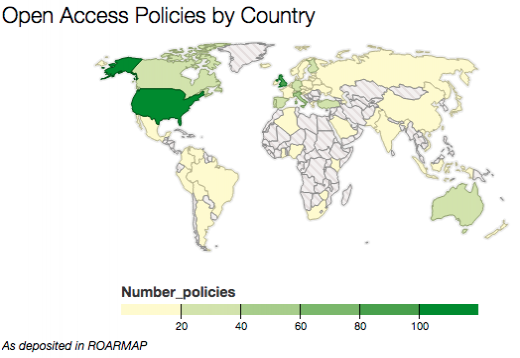
Chart JS is a clean charting library. Before you can create a chart,
you'll need to include the library in your frontend code. Once done, you
can use the API from the library to add charts and assign values. More
technical details are available here.
This is a good option for people who need precise control over look and
feel of their charts, but if you don't want to get your hands dirty
with the code, this is probably not the best option for you.
Created by the product science team at Medium,
this is one of most minimal charting tools available online. You can
just paste a link of a Google spreadsheet or a .csv file (input data)
and tool create a chart with the data. Charted fetches the data every 30
minutes, making sure the chart is up-to-date. Although available freely
online, you can host your own version by using the code.
D3 stands for data driven documents. This is a JavaScript library to
help you bind random data to the DOM (document object model) and apply
data-driven transformations to the document. As many of you may be
aware, DOM is a programming API that allows programmers to access
documents as objects, and these objects closely represent the document
structure they model. D3 provides APIs that can be applied to DOM
elements and transform the resulting HTML, SVG, or CSS documents. But
again, this method may appeal to programmers more than average users
because it involves writing code to create graphs.
Dygraphs is a flexible, JavaScript-based charting library. The main
attraction of Dygraphs is that it can handle huge data sets and produce
output that is interactive for the end-users. It requires some level of
web programming background to get started with a chart, but it is easier
to use than the previous libraries mentioned in this article. Take a
look at the example gallery to learn more about its capabilities.
Raw is a web-based tool that allows you to simply paste your data and
create graphs in few simple steps. Built on the D3.js library, it is
extremely easy to use and packs all the goodness of D3 into a format
that is ready to be used by non-programmers. You can choose to use the free web hosted tool, or fork the project on GitHub and host it behind your firewall.
Every once in a while, you face a situation that requires you to
display events as sequential timelines. This tool, Timeline, helps you
achieve this. To create timelines, all you need to do is format your
data, like in this example template.
Once you have the data formatted in a Google spreadsheet, use
Timeline's generator to publish it. That's it! You have the embed code
available now and can use it to embed the timeline in web pages. Here is
a video tutorial to make it even easier.
Mobile readiness is the key to high traffic and good conversion
rates. Leaflet is a lightweight, mobile friendly JavaScript library to
help you create interactive maps. Leaflet is designed with simplicity,
performance, and usability in mind. It works across all major desktop
and mobile platforms out of the box, taking advantage of HTML5 and CSS3
on modern browsers while still being accessible on older ones. It can be
extended with a huge number of plugins, has a beautiful, easy to use, and well-documented API and a simple, readable source code that is a joy to contribute to.
I hope this list helps you find the solution best suited for your needs. If you are interested in more data visualization tools, take a look at this list of more than 50 tools.
Do you have a favorite tool that should have made the list? We would love to hear from you—let us know your thoughts in the comments below.
Image by :
opensource.com
Data
visualization is the mechanism of taking tabular or spatial data and
conveying it in a human-friendly and visual way. There are several open
source tools that can help you create useful, informative graphs. In
this post we will take a look at eight open source, data visualization
tools.
Datawrapper
Datawrapper
To create a graph, click on the "New Chart" link on the top menu bar. You can then paste your data in the text area; then, the tool analyzes it and shows you the preview. If everything is fine, you can publish it. Datawrapper is fully open source, and you can download it from their GitHub page and host it yourself. It is also available as a cloud hosted, paid service on their website.
Image provided by Nitish Tiwari. Source.
Chart JS
Chart JS
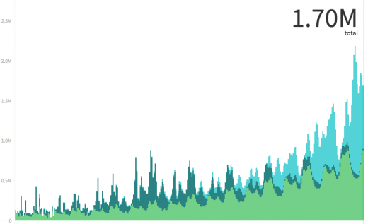
Charted
Charted
Image provided by Nitish Tiwari. Source.
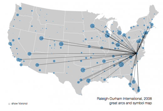
D3
D3
Image provided by Nitish Tiwari. Source.
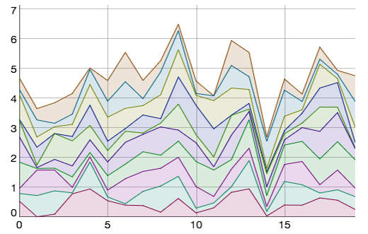
Dygraphs
Dygraphs
Image provided by Nitish Tiwari. Source.
Raw
Raw
Timeline
Timeline
Leaflet
Leaflet
I hope this list helps you find the solution best suited for your needs. If you are interested in more data visualization tools, take a look at this list of more than 50 tools.
Do you have a favorite tool that should have made the list? We would love to hear from you—let us know your thoughts in the comments below.

No comments:
Post a Comment